MEDIA LITERACY
Passion Project (Who am i?)

What you see above is called a zine. A zine is short for "magazine" which makes sense because it is just a smaller, less packed version of a magazine. This is about the smallest you can get when making a zine which made it challenging. The purpose of this was to add to my collaging and design layout skills. Another thing I hoped to work on in this project was my issue with perfectionism. I need everything to be perfect all the time or I restart it. Even if I have put hours and hours in, if I make a typo it is automatically a failure. I do not know why this is true about me, but it is something I aim to fix. With collaging, nothing is perfect. You are ripping, cutting, writing, drawing. It is supposed to be messy.
I had a lot more trouble with this 8.5x11 piece of paper than you would imagine. I have made at least eight zines since beginning the project, all with different ideas and colors and pages. None of them seemed good enough to show to people. My issue is that I can be as messy as I want when the art is for my viewing only, but as soon as it is something that someone, even just one person, may see, I become a perfectionist. Because this is on my website and is to be presented in class, I have had a lot of anxiety surrounding the beauty of the project. The lines aren't straight, my writing is messy (which is rare because lettering is my strong suit), and honestly I believe it looks like a train wreck--a cute train wreck at the most. Yet, I am proud of it. After weeks of trying to put it together, I sucked up my perfectionist feelings and just went to town. The playlist presented in here are just a few of the songs I listened to while making this zine.
The order for the zine looks quite odd until it is folded into book shape. Page one is on the far top right and it goes through eight moving clockwise.
The first page encompasses what the project is supposed to aim at: Who am I? I purposely used messy handwriting and badly drawn lines to get me comfortable with imperfection.
The second page is a self portrait with a twist. I did it blindfolded. This was another test to see if I was able to handle getting messy. It isn't pretty, though I will not lie I think I did a great job.
The third page is my birthdate and my zodiac sign; two things that I believe are very important to understand who I am. When you look at the characteristics (good and bad) of the libra, I fit into almost every description. I very much do believe that I am the way I am because of when I was born. Sure, it's nothing but a pseudo-science but hey, I don't believe in any god so I may as well attempt to believe in something.
The fourth page is my playlist which holds some of my all time favorite songs. This is just a snippet of the playlist I listened to while creating.
The fifth page is a self reflection. Because the zine is too small, I tried to just add a sentence or two. The meaning behind this page is that when I tend to think about who I want to be, I think of who I want to be LIKE instead. I will say, "I want to be a minimalist," or "I want to be a soccer mom." I seldom think, "I want to be independent," or "I want to be selfless." I try to label myself as if it makes it easier to cope with the fact that I really just do not know WHO I want to be.
The sixth page is a poetry scramble of a poem that I like. It does not have an author but I love to read it because of the metaphors it uses. I think this is the one page that does not fit with the rest. It really doesn't have to do anything directly with who I am or who I want to be. This page was more an individual exercise. You give the same poem to 100 people and ask them to scramble it to fit them better, every single person's will be different. This shows what my brain does with this poem and it would be interesting to see someone else's.
The seventh is the "Who Am I?" characteristically. I picked a few things I believe I can be and threw them on that page. I do not quite understand my purpose for it because it was more a creative impulse to do so.
The eighth, and last, is a sketch of some plants and starts with an exit from myself.
This is my passion project. Thank you.
Female representation
This project was inspired by the powerful women of Hollywood who often do not get the representation they deserve. I want to commend our actresses who are working so hard and receiving very little. First I chose to focus on specifically women in lead roles in movies and shows. Then, I focused on women of color in Hollywood and why we need more of them represented.
Advertising through generations

I chose this project because As you may have noticed below with my Tools of Persuasion project, I love the advertisements of the 80’s. I was interested to find out if my mom felt the same as me. She didn’t have the same passion for the colors or the photographs of the old advertisements, but shared my opinion that we have far too many advertisements now.
Tools of persuasion |
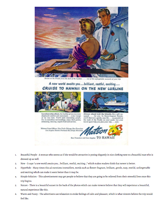
This project was interesting because it is such a simple advertisement, but there are so many different tools being used to persuade readers. I chose this advertisement because the art used in the 80’s is so interesting and beautiful. My favorite advertisements are from before I was born because the art is beautiful to study.
